Comic book cover art, old school vs new school and when it changed

COMIC BOOK COVERS/ART OLD SCHOOL VS NEW SCHOOL
Last time I showed you some behind the scenes pics and insight on creating a comic book cover.
And I mentioned that... I don't like doing them. To me, it's the least rewarding part of illustrating a comic book. And how most of the time it is being tasked with shoveling ten pounds of stuff into a five pound bag, visually. That is IF you are trying to do an actual cover for an actual story. That is often not the case in comic books in the modern age. There was an easily marked turn in- comic book covers going from showing you what is going on in the story/issue, TO comic book covers just being glorified pin ups.
Let's start with good ones...
Here's some examples of old school covers, that told you a story...
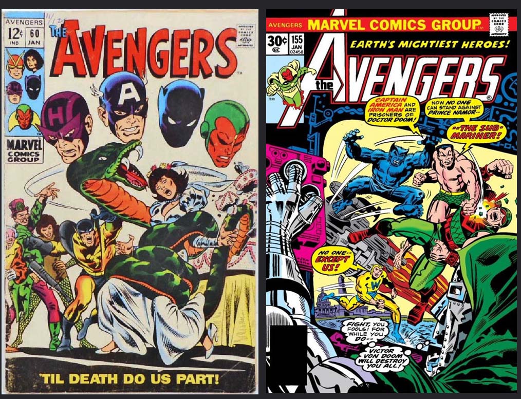
A little scene or snapshot of what happens in the issue. You see some old school techniques/visual langue in the floating heads looking on ( on the left cover) you have actual word balloons hinting at the point of the story ( cover on the right). It's very "bronze age" of comics to have someone on the cover looking at what is happening on the cover. That's the role of the floating heads on the first one and the one of the right accomplishes this by it being picture in a picture. The action on the cover is happening on a screen in from of Dr.Doom.
Both covers are not only beautifully illustrated but they capture your imagination. In THEORY that is the point of the cover, to get you engrossed in what is happening and wanting to read the story.
Here's a few more...
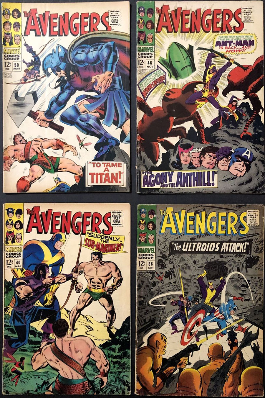
You get the idea, you have a snapshot, maybe a title that implies what's going on. It's specific to the story and that makes it a challenge...picking what scene to use,laying it out in one single image. That's not easy. It's a lot of info, visually, that you have to cram in. Could be a whole page or two worth of action you have to figure out how to encapsulate in one illustration.
It was/is tough and the illustrators who could do it well helped sell a lot of comic books.
THEN... this came along. The cover to Secret Wars no.1 by legendary illustrator Mike Zeck.
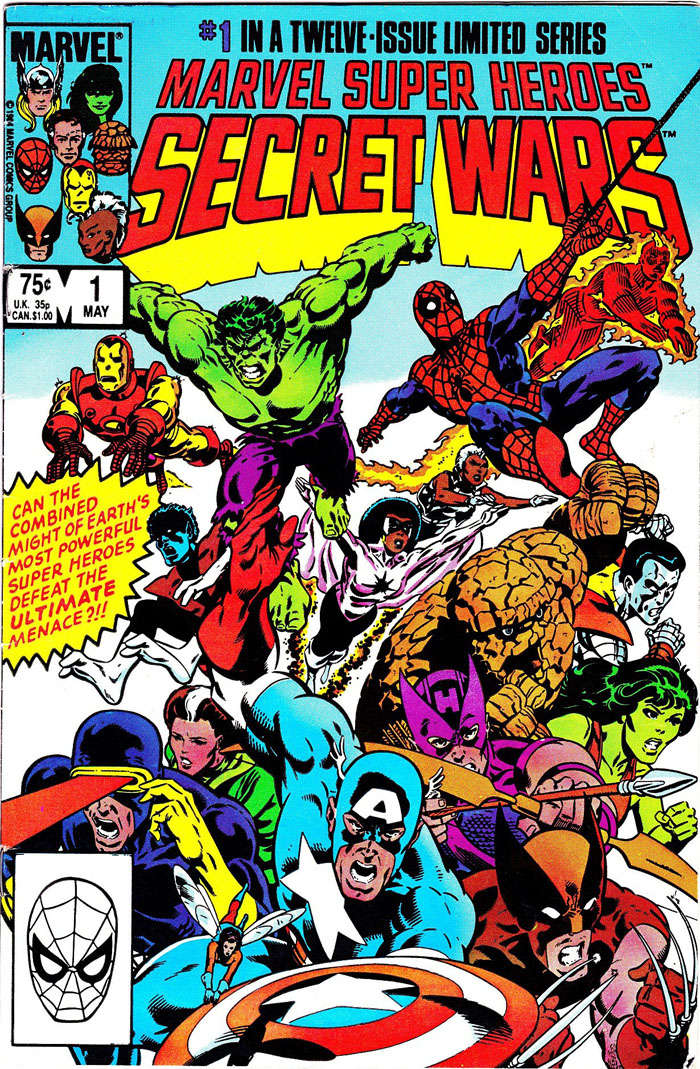
Beautifully rendered, exciting, and it blew my childhood mind. Not only mine but a generation or more of soon to be illustrators. And...THAT is what began an endless see of flat out crappy comic books covers.
That cover...it looks great, but what is it, actually? What, actually is going on? You have a bunch of characters charging in a formation at...something. Basically it shows you who is in the book and has them looking cool.
...Great. And for it's time it was innovative. But the kind of "innovation" that is only good once.
From that stemmed a flood of this...for decades...
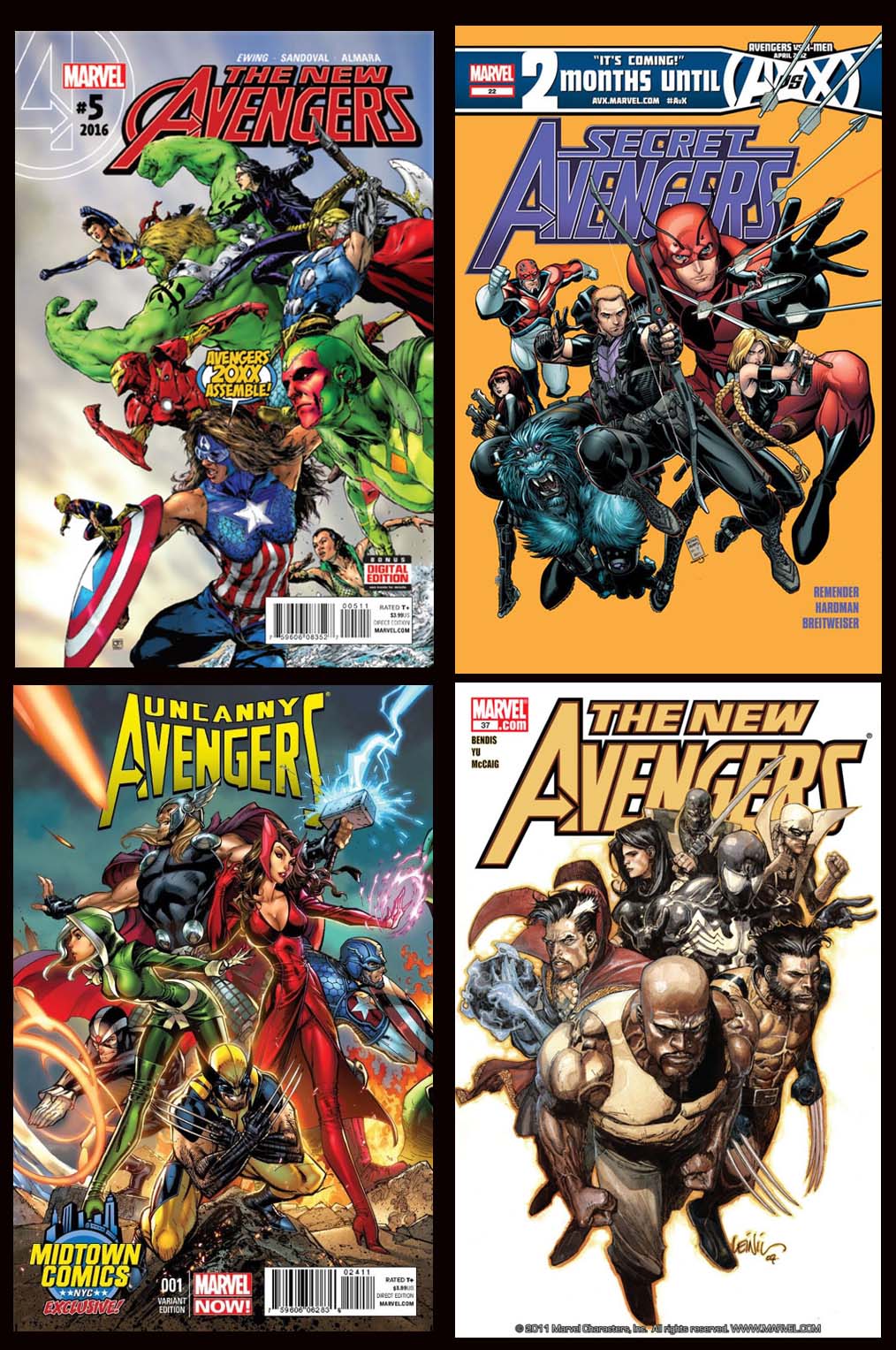
covers upon covers upon covers of the heroes in some formation looking cool. Covers that would make a great t-shirt, or poster, but tell you nothing.
There are several reasons this became the standard. 1st the influence of Zeck's cover ( like I mentioned) on...well, all of us. Every illustrator in the business now saw that cover when they were dreaming of becoming an illustrator and had their little minds blown. And some, having more skill than inspiration, just observed that as the template to use.
2nd, it takes a lot of work and time coming up with a legitimately good cover. Time is money. You get paid by the cover/illustration, not by the hour. If you can shave off the amount of time it takes to develop an idea, and just redraw an old idea...you have just given yourself a raise.
3rd...If the cover tells you nothing about the story, it can be used for any story in that series for months or years. I've done some covers where the editors basically wanted something "evergreen" so they can buy up a bunch of cover illustrations and plug them in whenever, for whatever. Most of the time they didn't even tell me what the story line was at all. I have illustrations of covers from years ago they still haven't gotten around to using. They will, they paid for them. and they have them in the holster for whenever the need arises. If they have a problem and the story-line gets changed at the last minute...they can just grab a generic cover and don't have to frett,
So that's why so many covers out there are just...heroes in formation looking cool.
Then of course there is the unapologetic "pin up".
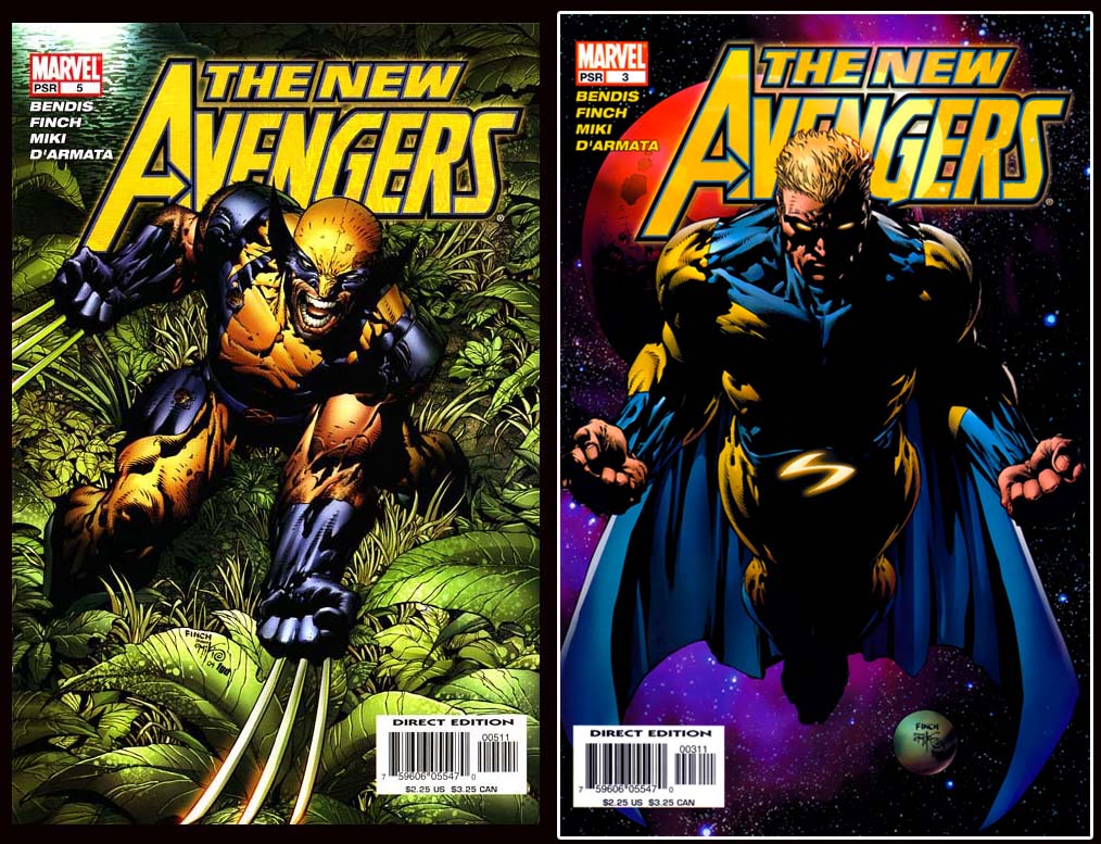
That takes a lot of skill but ZERO thought. There is no layout here, no composition. This is....this is a 20-30 year old professional version of an 11 year old drawing in his spiral sketchbook. Masterfully illustrated...but the same pose and composition you could find done by any child who decided to draw a super hero.
Oh...there is a fourth reason for all of this. Money on the back end. At the time of those old school covers I showed you, original comic book art was worth pretty much nothing. A lot of it just got thrown away, or...believe it or not...destroyed by the publisher. Anyone out there feel bad for losing your crypto wallet keys because at the time you figured bitcoin was just a gag? This might make you feel a little better-
almost NONE of the original artwork of the "golden age" ( 1938-ish-1956-ish) of comics still exists. And yes, that era includes early issues of Batman and Superman as well a dozens of other comics that have become part of the very fiber of our culture. Stuff like this...
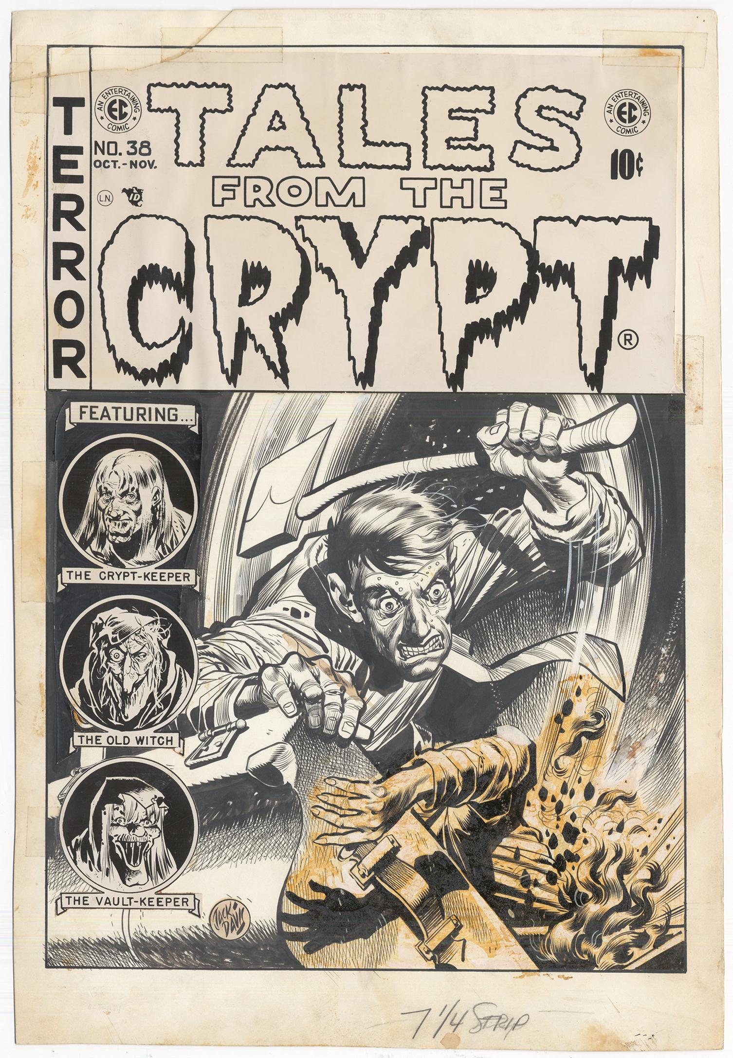
Actually, that artwork does still exist because it's publisher the legendary Bill Gaines was more forward thinking than about 99% of the rest of the industry at the time, illustrators included.
See right now cover art like that one above is worth more money than your car, possibly more than your house. BUT at the time...no one was looking to collect comic book art, hell even among five year olds, hardly anyone was "collecting " comic books. It was disposable entertainment. They read them, then cut the pictures out or who knows what. Along the same lines, Comic book art wasn't "looked down" on, it wasn't even considered. You got paid to draw the comic, and that's where the money came from, the end.
No adult was going to give you much for it, UNLESS they were a publisher themselves. Which brings us to art being destroyed. Publishers, to ensure the work was never tweaked and reprinted in some other book, by some other publisher, they would destroy the artwork once it got back from the printer. And as far as most illustrators figured "what do I care, saves me the trouble of throwing it out".
NOW however, original comic book art it is worth big bucks. The less specific it is, in most cases, the more it will be worth because it has a larger pool of collectors who want it. Everyone knows who Wolverine is. That cover with wolverine standing looking badass in the jungle...probably millions of collectors would love a cover of Wolverine looking badass. If is was Wolverine fighting something or someone specific or only partially shown, or not in his iconic costume, there is less of the percentage of collectors who'd want it.
Thus, despite these being a better covers in terms of capturing the imagination and probably in selling books...
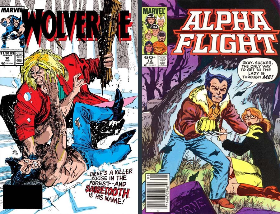
They simply aren't going to generate as much cash on the back end for the illustrator ( i.e. price/demand for the artwork, as this...
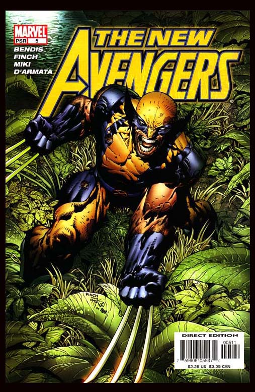
If you are looking to by original artwork of a Wolverine cover and you have a choice of one with him alone in his costume, and one with him and some character you never heard of (or don't like) in street clothes...you'll buy the one of him alone in his costume. It's simply the "demand" side of supply and demand.
So the mindless pin up type cover is easier, faster, more pragmatic for the publisher, it makes more money, and no matter how it may seem...most illustrators are not complete morons, so that's what became the go to cover idea.
Oh, and if it is a book with a female lead...of course you're just getting a cheesecake type pin up to speak to the inner boner of potential readers.
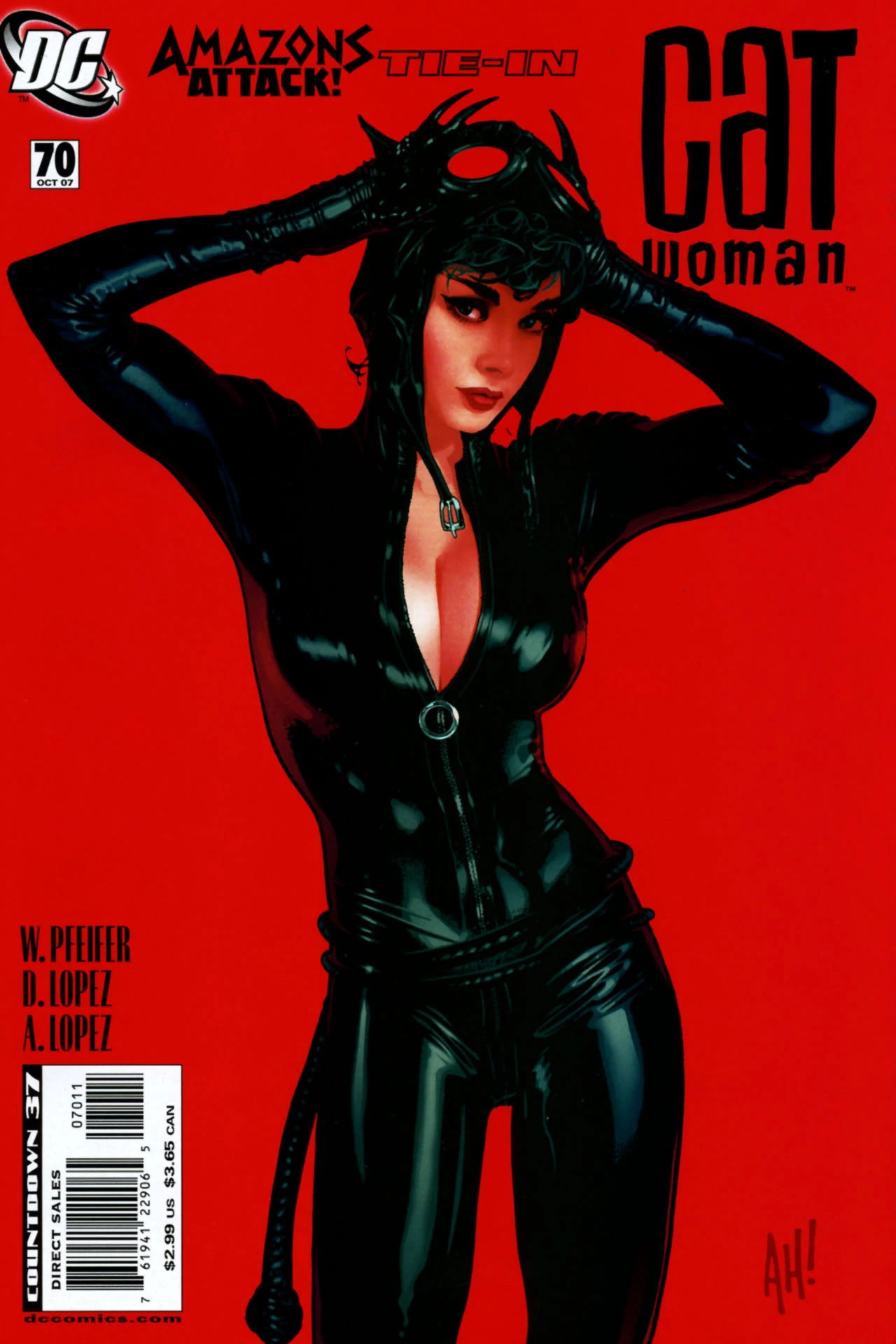
OH...sometimes that's not the case. Sometimes there's a cover...what would you call it? Someone cynical and old might call it "woke", I would instead call it a cover pushing the other way? I'm the last guy to gaf about "woke" but the push back doesn't bother me, in theory. If you're a creative sick of seeing something being done and want to do the opposite? good for you. go for it. Hell that's half my playbook LOL. EXCEPT for the problem of that play becoming a sea of covers that only exist as pushback, once again creating a sea of covers that tell you nothing about the story and do not capture the imagination. So, for female centered books, for the most part you're seeing either pin up or subversion of that...
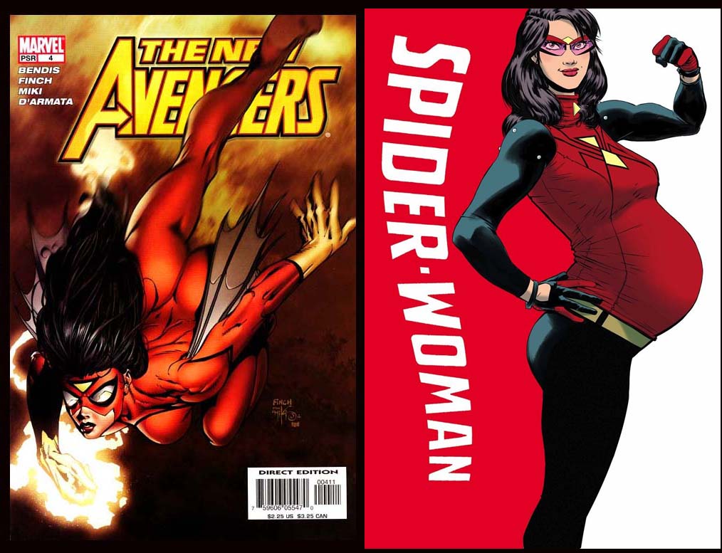
neither of which is telling you jack squat about the story when it comes right down to it.
THANKFULLY, I think the era of covers that have nothing to do with what is going on in the book SEEMS ( I said "seems") to be waning, and we're starting so see more illustrators trying to go back to making covers that tell you something.
None of which I will post here because, I am competing with these people after all Hahaha.
Actually, I had a bunch to show but I can not find the stinking file on my laptop because it is so full of files of variations and progress on the stuff I'm currently working on. Sigh.
anyways...
As always, homebase is here
https://www.arseniclullabies.com

NFT work here-
https://nftshowroom.com/arseniclullaby/gallery
https://makersplace.com/arseniclullaby/
Here are the other places to find me...my use of them is fluid, inconstant, susceptible to the whims and shifts of the paradigm
Torum-https://www.torum.com/u/arseniclullaby
Instagram- https://www.instagram.com/arsenic_lullaby_official/
twitter- https://twitter.com/arsenic_lullaby
bitchute- https://www.bitchute.com/channel/arsenic_lullaby/
youtube- https://www.youtube.com/user/arseniclullabycomics
Your content has been voted as a part of Encouragement program. Keep up the good work!
Use Ecency daily to boost your growth on platform!
Support Ecency
Vote for new Proposal
Delegate HP and earn more
thanks!
Nice collection of covers.
The whole collecting of art seems to be crazy now as people with serious money will pay a lot to get it. I threw away so many comics as a kid that might be worth something, like the old Star Wars series in the 70s. I get what you're saying about generic art. Do people even care that much about the stories? I think we have lost touch with some of the old simple pleasures.
Have you see the stuff @felixicarus000 is posting? Some amazing work there.
"do people still care about stories" ...THAT is a question that could take up a whole other blog. I'd say it yes, of course...but are people getting comic books for stories might be the question at hand. Or do publishers care about stories. A major problem with comics is they have lost their way in understanding just wtf they are trying to do, what their place in the pop culture is/should be...it's...a mess. I looked at @felixicarus000 on your recommendation, AMAZING WORK!
I had not really thought about the change in cover art until reading your article, and yes, you are right. I think the covers that give you a feel of what the story is about is so much better than the proverbial pin-up type of cover. I remember, and have the aforementioned Secret Wars #1 (I think I have two copies with different imprints as I was stationed in Spain at the time, so picked one up from the base book store, and one shipped by my dealer in San Diego). So much can be said about a story with one illustration, and, yes, you are right, a great cover can sell a lot of copies of a comic book.
The modern pin-up type, although beautifully rendered, just doesn't have the same appeal to me, but then I am a Neanderthal who prefers to read comics published pre-1990.
Great article, I really appreciate your sharing your insights on cover art. And yes, not only do I still collect and read comics, I have my daughter into comics as well.