A NEW HEART TO HEART COMMUNITY HANGOUT THUMBNAIL
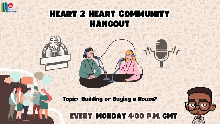
Before now, I have been looking forward to finding the time to recreate the thumbnail of the heart-to-heart community hangout, but I have not been able. So I decided to sit a few hours in front of my computer, trying to get some inspiration for what to create. It was very crazy, I must say, as coming up with an idea was not easy at the end. I came up with this:

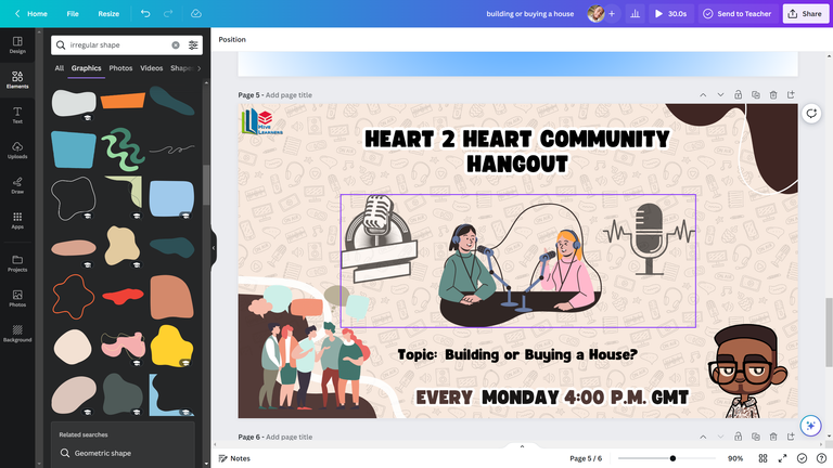
After taking a look at it, I felt, Hmm, there is quite too much space at the top right corner of the picture. So I decided to add an irregular shape to make it a little bit more sleek.

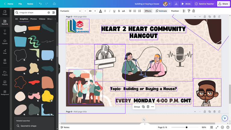
Yeah, you can see that I am making use of Canva. I make all my designs using Canva, and I have improved a bit over the years.
Although I don't always make my thumbnails as complex as this (not like saying this design is complex), I just use a strategy that when I make my designs, I don't sit for hours making them as I did for this.
I spent at least 2 hours on this design, as starting up something was not easy. My aim was to make something sleek and tasty. I never initially wanted to go for brown; I was looking at white and blue, but it was not really tasty to my eye more because of my avatar.
The skin colour of my avatar is brown, so I thought, Why not create a thumbnail that goes with the same colour of my avatar? The inspiration started coming t untilI was able to finish up to this stage.
I decided to try out some animations available on Canva. So what I did was select the items I would like to animate, then click on animate.

Here are two animations that I like from this design that I was able to create.

I like this first animation because it would really fit pop music as an intro for a video. I may be making use of this animation most often when editing the recording of the hangout.

I like this second animation because it is gentle and cool. It moves with a slow progression and would go in line with songs like that.
If you like this design and you want me to share a tutorial on how I made it, Feel free to let me know in the comment section.
𝙰𝙱𝙾𝚄𝚃 𝚃𝙷𝙴 𝙰𝚄𝚃𝙷𝙾𝚁

Designed by @ grisvisa
Starstrings01, also known as Giftedhands, attends the Federal University of Agriculture in Abeokuta to study mechatronics engineering. He is a lover of the hive, a guitarist from Nigeria, and a student.
His ambition on Hive is to be more than just an ordinary blogger; he wants to be someone with a purpose. That's why he started the newbies initiative @newbies-hive to help guide and support newbies. Please follow the @newbies-hive curation trail by clicking here.
He tries to juggle education with being active on the chain, but his love and passion for Hive keep him on track..
All gifs included are powered by Tenor
Some posts you might be interested to read:
QUALITY ENGAGEMENT Vs. QUALITY CONTENTS Vs. GAINING VISIBILITY ON HIVE
BEING UNIQUE DOESN'T MAKE IT ORIGINAL || HIVE REWARDS ORIGINALITY
@starstrings01 That's great, can't wait to participate😎
Talking about colours, I always prefer something not shouty and this kind of brown is just so cool and calm. I like it and the design in there are just so creative. Good that you thought of changing the previous thumbnail to something different. This is cool, well done for the nice effort
Congratulations @starstrings01! You have completed the following achievement on the Hive blockchain And have been rewarded with New badge(s)
Your next target is to reach 45000 upvotes.
You can view your badges on your board and compare yourself to others in the Ranking
If you no longer want to receive notifications, reply to this comment with the word
STOPTo support your work, I also upvoted your post!
Check out our last posts:
I think it was brilliant to consider the color of your Avatar. Initially, colors like brown may not appeal to one, but it you set the dials right, it could be a banger—just like this one. I'm thrilled to see such a fresh look for the hangout sessions. And, also, it'll be much easier to make changes in the future, unlike the previous one.
Yeah exactly... to make it able for me to make changes was the reason why I thought of creating another one.
Just like you, I don't like using brown. I am the blue, red and white kind of person when talking about colours.