The 7 Steps I'll Never Miss When Creating A Design.
Each time I plan to make a design, I already have a default guide to help me accomplish the task better and it has improved my designs with any design app or software. I started learning graphic design around November 2021 when I paid for graphic design class on Whatsapp. I started with Canva and was creating designs every night, I preferred doing during the midnight hour.
I later on switched to PixelLab which seemed to be complex at first, but more lovely after few weeks of taking a course and watching Youtube videos. I got better at it only because I create designs daily and watch specific tutorials on Youtube. I am still learning because there is more, if I stop learning, I'll stop growing.
Recently, I have been creating designs with CorelDraw software on my PC and I still watch videos on preferred Youtube channel.
Now, let me show you these 7 steps I'll never miss when creating a design.
One of the secret of great men who appear to have gained mastery in any niche and clearly are one of the best is this...They don't skip basic.... Oh Yes! they don't, even at their level of expertise. That is why I don't skip these steps 👇👇
THE 7 STEPS
- Sketch (Foreknowledge)
- Elements
- Colour
- Background
- Typography
- Alignment
- Shapes and Images.
I will be explaining this steps ( and you'd know why I said I'll never miss them ).
SKETCH (foreknowledge)
You might be wondering what sketching means. It is the act of drawing a design or knowing exactly how a design should look before creating the actual design. The best designs starts with a sketch on paper or in the head (i.e brainstorming how a design should be).
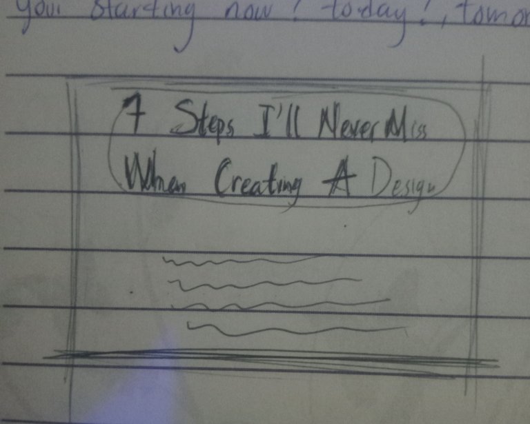
The picture above is an example of a sketch.
That's why I added "foreknowledge", you get it, right? Okay let's move to the next one.
ELEMENTS
They are objects/images needed in a design. If you ever used Canva to design, you'd know there is a place for "elements" to select objects that befits your design. For example, a school flyer should have any of these elements; school bus, the school uniform, school logo, book, bookshelf, pencils, pen, classroom or even a part of the school building.
They are necessary objects needed to pass the intended information on the design. Always use the right elements,imagine a club flyer design with the picture of a Bible on it (🚫 no way).
COLOUR
I won't define colour for you but I'll share what you need to know about colours when creating a design.
i) Colour theory
ii) Colour wheel
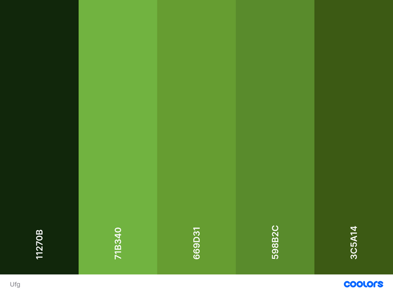
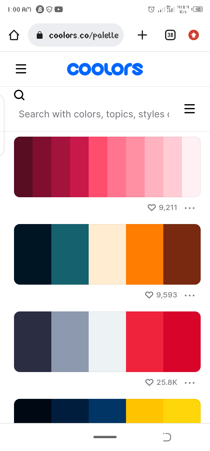
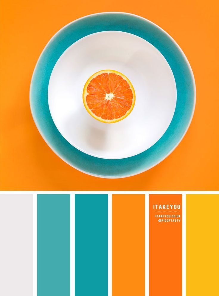
They will guide you whenever you want to make a design, make sure you do your research on colour theory and colour wheel. I will share some colour pallet and sites ( https://coolors.co/palettes/trending ) with you here 👇
 |  |  |
|---|
 |  |
|---|
Click on images to see in full.
Import any of these palettes to your design app/software, then, use your colour picker to pick your desired colour from the palettes.
BACKGROUND
You know what a background is, but I will define it here. It is the foundation upon which every other materials/elements of a design sits on. The type of background you use will determine how visible every other elements will be on the design.
For example, a white colour or any other light colour should be used on a dark coloured background and a dark colour should be used on a light coloured background.
Here are some examples 👇
 |  |
|---|
TYPOGRAPHY
This simply means the typeface of the text. There are only 4/5 typography classification , I cannot list and explain them here for you, rather, google it yourself to know better.
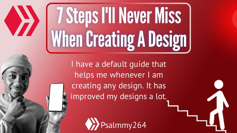
Don't use more than 3 fonts in a particular design else your design will look so immature.. I used only two fonts for the flyer design I made for this post.
HIERARCHY
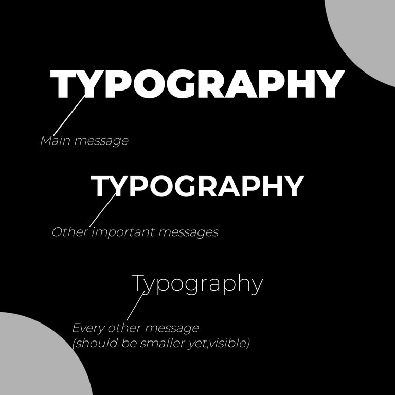
This is the arrangement of design texts and elements on a design according to the degree of importance. For example, a topic or the main message of a design is usually the most visible than every other elements in the design.
In text, the main message should be bolder and easily seen than every other thing on the design. I made the design below to illustrate HIERARCHY
ALIGNMENT
This is the proper arrangement of everything on a design,but mostly fonts (texts). There are three types of alignments.
Right Alignment
Left Alignment
Centre Alignment.
Two among the three can be used on a design but rarely used.
IMAGES AND SHAPES
These are used to add more effects to a design. Shapes can be inform of square,triangles, rectangles, circles, e.t.c. I used circle and rectangle shapes on the flyer design for this post.
Images helps a design to speak better to its audience. High quality images are required to get attention of your audience and any image you use should already say a part of the message a design is passing to its audience, like I used on the flyer for this post.

I hope this post was helpful and an interesting one to read? YES?
Okay, I will be making a video on how to implement these basics. Stay tuned so you won't miss it.
See You In The Next Post!!😎
Congratulations @psalmmy264! You have completed the following achievement on the Hive blockchain And have been rewarded with New badge(s)
Your next target is to reach 50 comments.
You can view your badges on your board and compare yourself to others in the Ranking
If you no longer want to receive notifications, reply to this comment with the word
STOPCheck out our last posts:
Support the HiveBuzz project. Vote for our proposal!