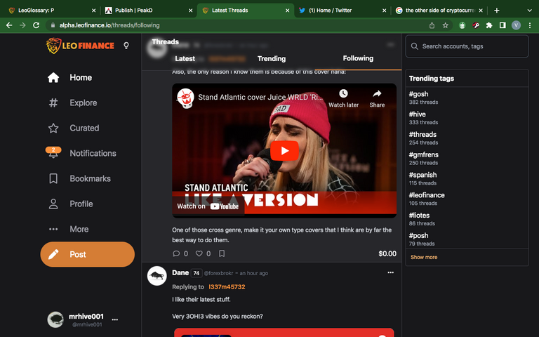
The Classification Of thread Into "Latest , Trending , and Following" Gives it A Top Notch Look with a Whole new Vibe

Just as it was promised by boss @khaleelkazi after the launch of the project blank on the 14th day of February 2023, he made mention of keeping the window of improvement and the addition of more features till the everything app is established. Here is the latest about threading in the new UI.
Just as more than we expected or thought of, the project blank is gradually coming into play and, at the same time, projecting a takeover of power from the old UI to the new UI, proving its point and view and creating the space to believe there are more reasons why it should be called the everything app. The latest development now seen in the threading aspect of the new UI is another sphere of engagement and an easy-going feature every threader on this new UI would want to appreciate and make use of.
The Division Into Excellence
It is quite more than enough to say and believe that the project blank has come to stay and that it is already creating the difference and drawing the attention needed to prompt the transfer of power from the old UI to the new UI. It isn't just a mere assertion that the diversion of attention and the specification of the threading sphere are of great importance, such as what can be compared if one logs in to the old UI; maybe I might say the idea was generated from there because the old UI has a patch of that.
Latest:
This still isn't a true navigation and division on the new UI as it pertains to threads. In here, one sees the newest of the threads published by threaders and the impression it has. No need of trying to stress oneself into finding the newest of the threads; just tap in to the other side division of the thread, and the whole lot of impressions is seen.
Trending:
Of great importance to the threading aspect of the new UI, in this section one finds the most looked-for, most popular, and most important threads published on the thread aspect of the new UI. Not just that it shows the trends of threads, but also the much greater impressions it has both in votes and engagements.
Following:
Another section of the masterclass deals with this aspect of threading. This, I feel, is a specialty and much more about individual preference. For those who constantly follow, this serves it right for them to see the threads published, the impressions coming in from votes and comments, and the directions through if the thread has such. Instead of having to look for all these earlier, just opt in to the followers space and have a glimpse of it all.
log on through this link and feel it all.
Posted Using LeoFinance Beta
https://twitter.com/1557752718500020226/status/1638407120298156033
The rewards earned on this comment will go directly to the people( @mrhive001 ) sharing the post on Twitter as long as they are registered with @poshtoken. Sign up at https://hiveposh.com.