Hive Price Analysis with Bollinger Bands
Hello fellow Hivers,
I hope you are well. It's a sunny weekend here but I'm still at home because of the backlog of work. Today I did some quick analysis of Hive's price relative to the levels of the bollinger bands.
For the last few days the Hive price has been below the lower bollinger band. I feel like there are some buying opportunities when analyzed to other indicators too. I had shared a post about analyzing Hive price with Moving Average 20 days ago. Actually, Bollinger bands indicator is basically like moving averages but there are some differences. I wanna talk a little bit about these differences.

Bollinger Bands are like a set of guardrails for the price of a cryptocurrency. I think they are like an invisible force field that keeps the price from getting too high or too low. When the price gets close to the upper Bollinger Band, it's like it's trying to push through a ceiling, and in other scenario, it's like it's trying to crawl along the floor. These bands are calculated based on a rolling mean and standard deviation of the price over a specific time period.
We knew that we can use moving averages to identify trends in the price of a cryptocurrency. For example, if the price is above the moving average, it might indicate an uptrend, while if the price is below the moving average, it might indicate a downtrend. Quite easy.
The key difference between Bollinger Bands and Moving Averages that I see is that Bollinger Bands show the potential range of the price, while Moving Averages show the overall trend of the price. Bollinger Bands might give us a sense of whether the price is overbought or oversold, while Moving Averages can help you identify longer-term trends in the price. So, actually we can say that the Bollinger Bands are like guardrails, keeping the price of a cryptocurrency in check, while Moving Averages are like a smooth ride, showing the overall trend of the price.
Using the Bollinger Bands Indicator on Hive Price History
I will start by importing the libraries required yfinance to get the Hive price data. I had talked about before already. If you do not familiar yet, you can get more information about them by simple search on Google.
import yfinance as yf
import matplotlib.pyplot as plt

# Hive price data
hive = yf.download('HIVE-USD', start='2022-01-01', end='2023-03-10')

# Bollinger Bands
window_size = 20 # 20 days
num_std = 2
rolling_mean = hive['Close'].rolling(window=window_size).mean()
rolling_std = hive['Close'].rolling(window=window_size).std()
upper_band = rolling_mean + (rolling_std * num_std)
lower_band = rolling_mean - (rolling_std * num_std)

# Hive Price with Bollinger Bands
plt.figure(figsize=(12,6))
plt.plot(hive['Close'], label='Hive Price')
plt.plot(rolling_mean, label='Rolling Mean')
plt.plot(upper_band, label='Upper Bollinger Band')
plt.plot(lower_band, label='Lower Bollinger Band')
plt.title('Hive Price with Bollinger Bands')
plt.xlabel('Date')
plt.ylabel('Price (USD)')
plt.legend(loc='upper left')
plt.show()

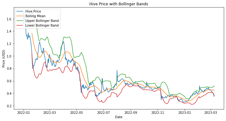
Looking at the graph, we can see that the Hive price has been fluctuating between the upper and lower Bollinger Bands for most of the past year. This indicates that the price is trading within a relatively stable range, and there haven't been any significant breakouts or dips.
However, we can also see that there were a few instances where the Hive price briefly broke above the upper Bollinger Band or dipped below the lower Bollinger Band. These instances may be opportunities to buy or sell depending on trading strategy. Actually, we can see this scenario in the past few days. Let's zoom in on the graph of the last week to make a clearer observation here. I think we can do this better with the plotly library.
import plotly.graph_objs as go

# Hive Price with Bollinger Bands
fig = go.Figure()
fig.add_trace(go.Scatter(x=hive.index, y=hive['Close'], name='Hive Price'))
fig.add_trace(go.Scatter(x=rolling_mean.index, y=rolling_mean, name='Rolling Mean'))
fig.add_trace(go.Scatter(x=upper_band.index, y=upper_band, name='Upper Bollinger Band'))
fig.add_trace(go.Scatter(x=lower_band.index, y=lower_band, name='Lower Bollinger Band'))
fig.update_layout(title='Hive Price with Bollinger Bands', xaxis_title='Date', yaxis_title='Price (USD)')
fig.show()

The code below calculates the date range for the last week using the datetime and timedelta modules, and then filters the data for that date range using loc. It then creates a Plotly figure object fig, adds traces to the figure using go.Scatter, and updates the layout of the figure using update_layout. And, it displays the figure using fig.show(). In this way we can see the last week data.
# Last week date range
last_week_start = datetime.now() - timedelta(days=7)
last_week_end = datetime.now()

# Data for last week only
hive_last_week = hive.loc[last_week_start:last_week_end]
rolling_mean_last_week = rolling_mean.loc[last_week_start:last_week_end]
upper_band_last_week = upper_band.loc[last_week_start:last_week_end]
lower_band_last_week = lower_band.loc[last_week_start:last_week_end]

# Hive Price with Bollinger Bands (Last week only)
fig = go.Figure()
fig.add_trace(go.Scatter(x=hive_last_week.index, y=hive_last_week['Close'], name='Hive Price'))
fig.add_trace(go.Scatter(x=rolling_mean_last_week.index, y=rolling_mean_last_week, name='Rolling Mean'))
fig.add_trace(go.Scatter(x=upper_band_last_week.index, y=upper_band_last_week, name='Upper Bollinger Band'))
fig.add_trace(go.Scatter(x=lower_band_last_week.index, y=lower_band_last_week, name='Lower Bollinger Band'))
fig.update_layout(title='Hive Price with Bollinger Bands (Last week only)', xaxis_title='Date', yaxis_title='Price (USD)')
fig.show()

Here, the current Hive price being below the lower Bollinger Band after 6 March suggests that it may be a good time to consider buying some amount. Now, don't get me wrong, fellow Hivers, technical analysis is not the be -all and end-all when it comes to investing in cryptocurrencies, but it's definitely a good way to get a feel for what's going on in the market. It is always better to analyze together with several indicators.
Important Note: The code I provided does not include any predictions or forecasting for the Hive price. The code simply generates buy and sell signals based on the Bollinger Bands indicator and visualizes the resulting signals on a chart. It is not an investment advice.
Whenever I have time, I try to examine the details of technical analysis tools used in finance. I will continue to reflect my weekend efforts related to my basic financial analysis here. In fact, predicting future prices of cryptocurrencies is a complex and challenging task that requires more than just simple technical analysis. It involves a combination of factors such as market sentiment, news events, global economic conditions, more, more and more. Remember that predicting prices with high accuracy is still an active area of research and is subject to a high degree of uncertainty.
Happy weekends,
Yaser
Posted Using LeoFinance Beta
Yay! 🤗
Your content has been boosted with Ecency Points, by @kedi.
Use Ecency daily to boost your growth on platform!
Support Ecency
Vote for new Proposal
Delegate HP and earn more