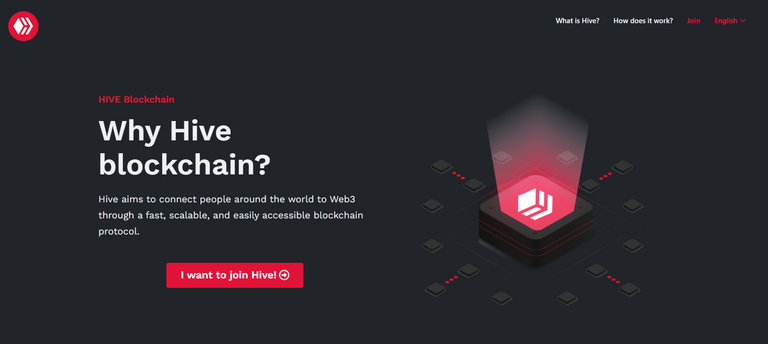
Official launch of "WhyHive?"

After the excellent presentation of the Hive Creators and WhyHive project on HiveFest, it is time to share the final product, receive feedback from the community, and improve it.
Why did we do "WhyHive?" There are many reasons, but let's share the main ones:
Index more content about Hive on the web and improve SEO related to basic concepts related to the ecosystem.
Attract people from all over the world to Hive.
Have an alternative website with more detailed information about Hive.
You can read about the pre-launch announcement if you want more details check out this post
"WhyHive" It is a landing page created using a WordPress website, and it can migrate it to another page builder. For now, it is a minimum viable product, which will be periodically changing and improving.
Visit "WhyHive?": https://whyhive.co/
@enrique89 and @samgiset designed the website, and @eddiespino reviewed it.
We want to thank you for their collaboration @guiltyparties y Jeff Daub.
And also big thanks to @theycallmedan for sponsoring this site.
We want your constructive feedback to improve.
Visit HiveCreators: https://hivecreators.co/

I just visited the webpage. It's beautiful and user-friendly. This is definitely going to help people understand Hive a lot better and make onboarding twice as easy. I'll be sending it to a couple of friends who have questions about Hive that I've been too lazy to answer.
Massive thanks to the creators. Y'all are awesome.
Posted Using LeoFinance Beta
apologies if this has already been mentioned, but the little animation that is playing about give being web3 causes the page to jump around on mobile, probably not an issue with desktops/laptops but it jarring on any mobile device.
it's not great practice to have a page jump like this.
you could probably resolve it by reserving space or just not having it animated.
Thank you for your comment, I will review this, that is why we made this post to receive feedback
no es por nada pero la pagina quedo demasiado bien! muy estetica
Esta genial bro
The website looks fantastic! Really like the nice, clean design. I'm sure it will entice more users to join.
I visited the page. It was really awesome. Very simple to navigate and really easy to understand. It felt like I was seeing from the eyes of a first timer. I love it.
Appreciation to all the developers, sponsors and everyone involved one way or the other. Thanks for making Hive a great place.
Hive - Hive Impressively Valued Extraordinary. Awesome blockchain with better improvement daily
Super useful post - I am new and learning to the ecosystem... and now time to head to why hive! Should have gone there first maybe ha
It’s cool that you take feedback from the community to improve.
Tip sent bcoz you're a good Twitter promoter. Keep doing a good job!
Congratulations @hivecreators! You have completed the following achievement on the Hive blockchain and have been rewarded with new badge(s):
Your next target is to reach 1750 upvotes.
You can view your badges on your board and compare yourself to others in the Ranking
If you no longer want to receive notifications, reply to this comment with the word
STOPCheck out the last post from @hivebuzz:
Another way to promote Hive indeed! The page looks amazing and it's easy to navigate. More like a one-stop place to know more about the Hive blockchain :)
Congratulations for this smooth birth, @hivecreators , @enrique89 & @samgiset !
"WhyHive?" will undoubtedly be one of my main tools, along with "HiveLightning", to foster the onboarding of Salvadorans and other Latin American content creators.
Is a Spanish version of the website planned for the near future? 🙂
It is already available, you can enter here: WhyHive en español
Awesome, thanks for your dedication and efforts!!
cool
This looks great and hopefully can attract more users to the environment!
kerja bagus.
ini terlihat sangat menarik. Jadi sangat mudah bagi saya untuk mempromosikan sarang lebah di Indonesia khususnya. mengundang orang untuk bergabung dengan sarang.
https://twitter.com/hive_creators/status/1459903141344956417
The rewards earned on this comment will go directly to the person sharing the post on Twitter as long as they are registered with @poshtoken. Sign up at https://hiveposh.com.
Congratulations guys on the website, the design looks really professional!
btw, if new users signed up through that website, will you be able to track those new sign-ups and how can we sustain user retention? It would also be best if there will be people people to guide them once they arrived here, there are a lot information on how to navigate hive but based on my experience after onboarding a number of people, it's quite easy to get lost here and 'most' newbies really need hand-on-hand guide.
Thank you for your comment, yes, one of our focus is to be able to measure that in order to obtain better growth and retention.
yay, thats good to know! am excited for how this project! I can now start adding the website link on my fb page and our community fb page!
thank you so much for all your hard work! best of luck, guys!
👍 This is awesome
Very polished and clean website, I think this is what's needed to convince and educate more people, well done.
Following!
Everything that will make it easier for more people to learn about hive and start using it is a great innitiative in my eyes.
The site looks really cool. I hope it gets translated into lots of other languages.
great job!
i think if it was less wordy on the frontend and had more real world people videos on it, that might be helpful. people need to know what they are walking into rather than just protocols and such like. it needs a bit more soul to it. but nice and clean regardless.