El Paseo Shopping Center and a very convenient partner
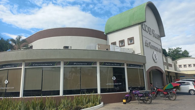
As I mentioned in my previous post, a visit with my brother to the city of Cagua, which is a few kilometers from the city of Maracay, became a great opportunity to record some of the most striking buildings in that area from an architectural point of view. I already showed you the goodness of La Trinidad Shopping Center, but a few meters away from it there are a couple of structures that even though they seem to be unrelated, I considered them to be perfect partners from a commercial point of view and therefore very beneficial for the citizens of the city of Cagua.
The first thing I noticed about these partners is that they have very different architectural concepts, one has a colonial air, while the other has a structure designed for modern times, even in the colors you can see that they did not seek to get along and that makes me think that those who are in charge of the administration of these buildings did not seek to unify any criteria beyond the physical proximity, it is noticeable that everyone is on their own side, but it does not prevent them from being very convenient partners of each other.

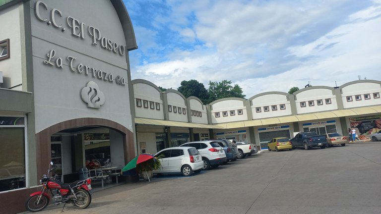
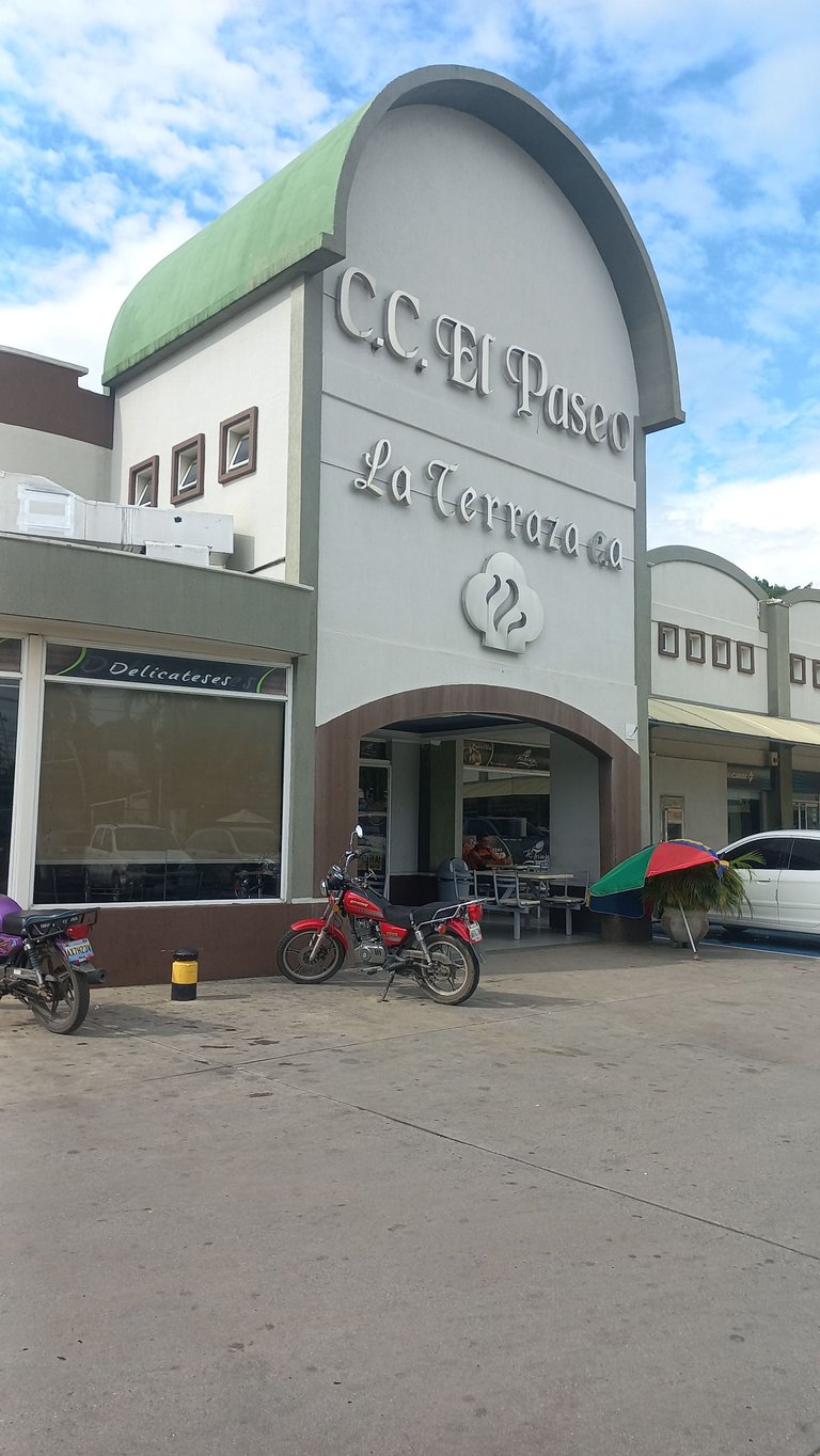
So, first I will show you the small El Paseo Shopping Center. It is remarkable that it has been built quite some time ago, but it is also remarkable that the administration tries to maintain it in the best possible way. It is remarkable that all the commercial establishments are occupied, and well, I consider that this is positive from the economic point of view. I could see that there is a pharmacy, a small supermarket and a bank, but perhaps the most striking thing is the bakery “La Terraza”.
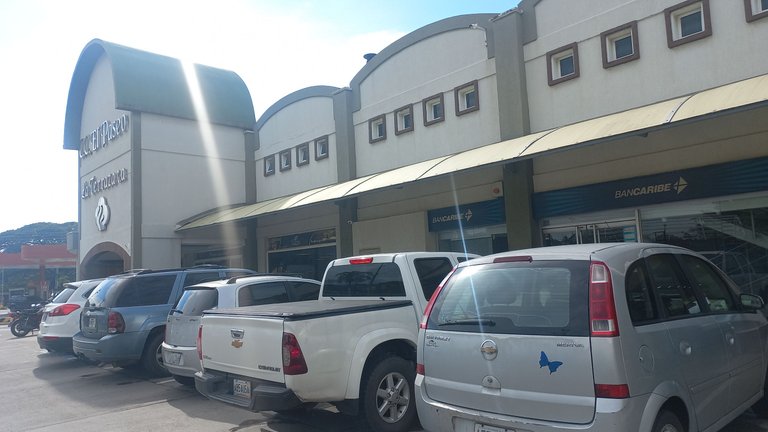
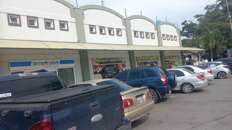
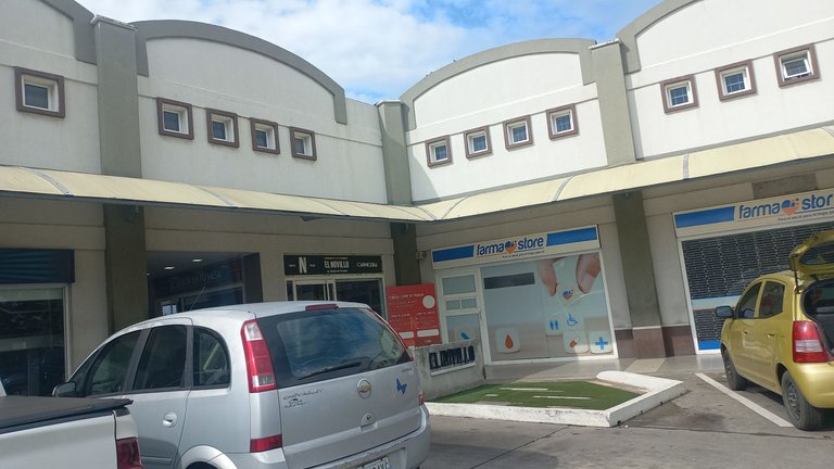
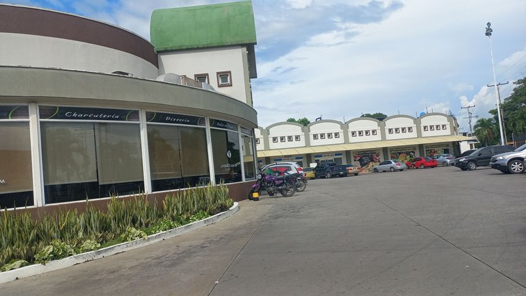
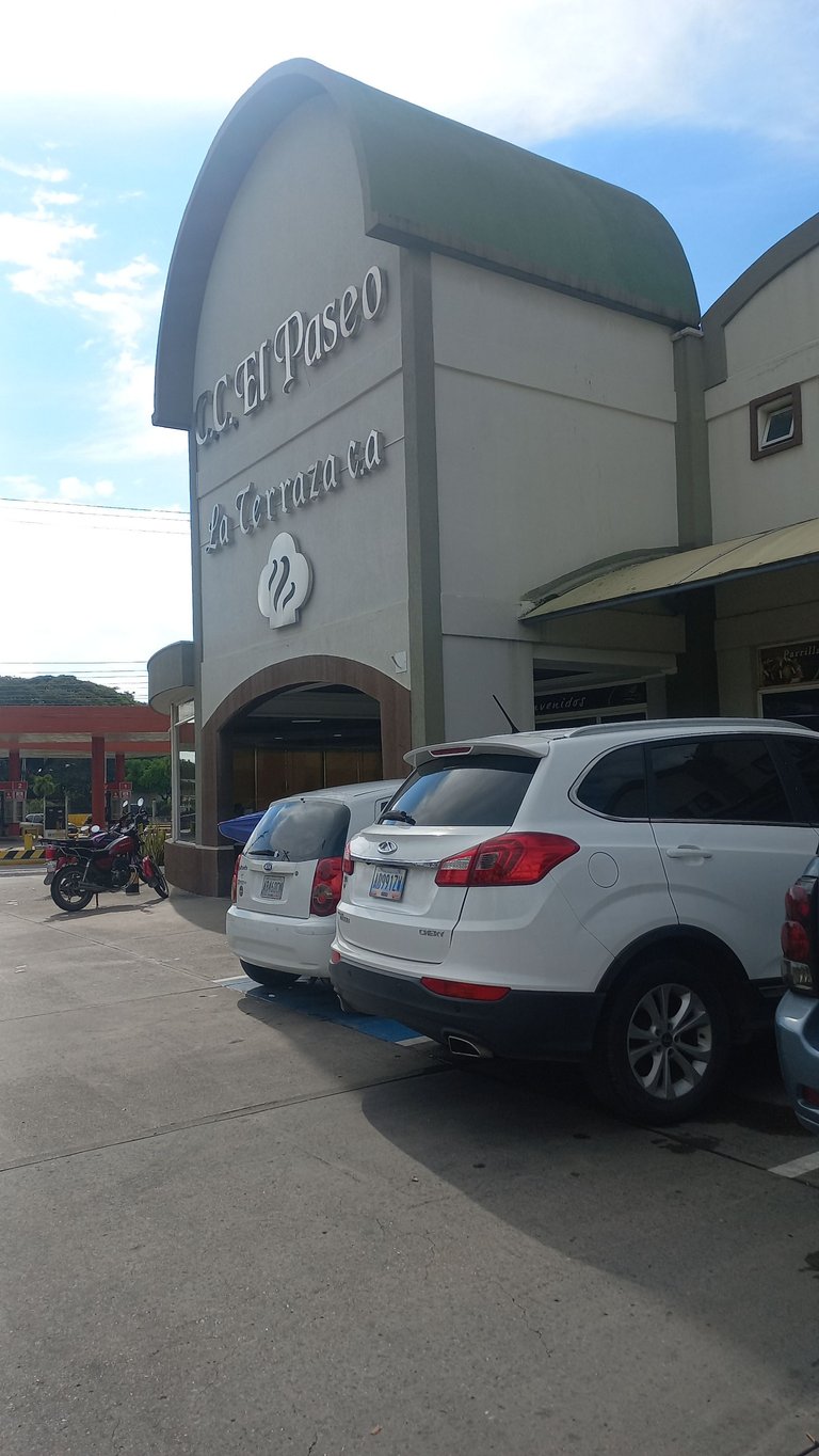
The bakery occupies the largest space in this small shopping center, in fact, I would say about 50%. The rounded side features a large arched entrance that is perhaps the most striking feature of the overall structure. The name of the mall and the bakery lie in silver letters under the green arch. I would say the style is colonial, but modern, I don't know if there is a specific name for that style, but for now that is the impression I get.
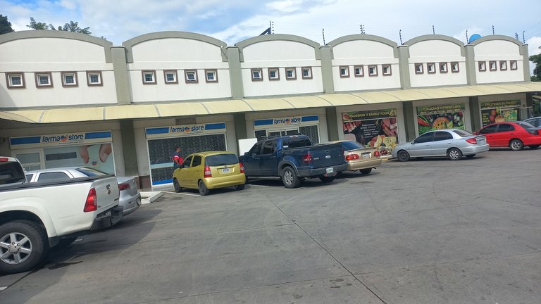

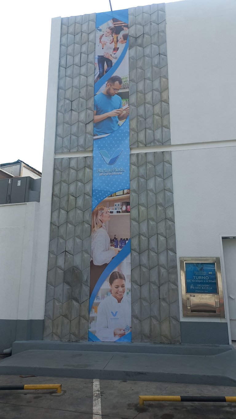
Immediately next to the El Paseo shopping center, we have the “FarmaVista” pharmacy. This structure is much more modern and with more stylized colors. Gray, white and blue are what we mostly see and they bring an air of integrity that is typical of pharmacies around the world. The structure is taller than its commercial neighbor, but it does not overshadow it in any way visually. I am struck by the fact that the style of construction is entirely square or rectangular, i.e., no round or triangular elements are visible. I am also struck by the different reliefs or styles of the walls.
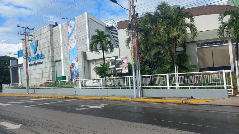
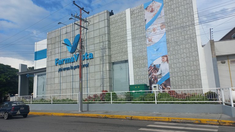
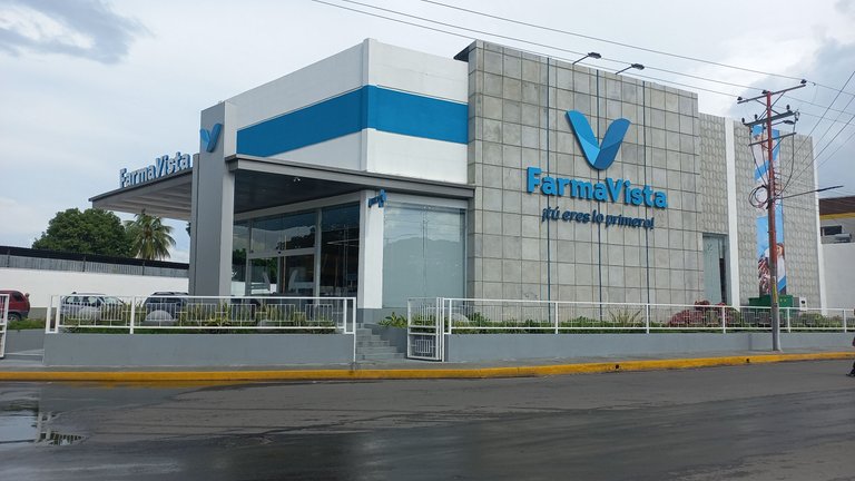
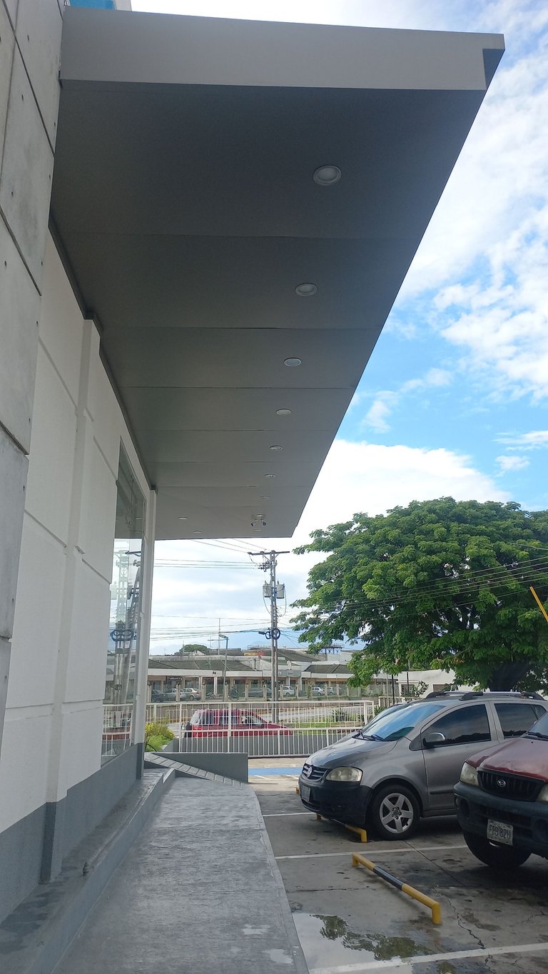
It comes to my mind the fact that these are two quite convenient companions since the common citizen can take advantage of them to do his daily shopping in a centralized way. Who doesn't want to have a coffee or eat something after going to the bank, to the training or to the supermarket? Both structures have parking, so they can't be more convenient. At the moment these are the only interesting structures (along with the one in my previous post) that I could find in the city of Cagua, maybe there are more, but they are not of my knowledge. It was a pleasure to share with you for another week, see you again!

Tools used and credits:
- Photos: Samsung Galaxy A32
- Translator: DeepL Translate
- Location on Google Maps: https://maps.app.goo.gl/xwjPM9kBnqg2VZY6A

I like the desing of this shopping center, especially the roof part. Cagua city is a little unknown for me. I can see that it has interesting places to visit and go shopping.
In fact, I don't know much about Cagua, but the little I do know seems quite interesting. Thank you very much for stopping by.
Congratulations, your post has been added to WorldMapPin! 🎉
Did you know you have your own profile map?
And every post has their own map too!
Want to have your post on the map too?
Thank you very much.
Hey @dinaaczib you are welcome.
Thanks for using @worldmappin 😘
The mall has a nice circular design, the arch shape on the roof looks spectacular, a modern and eye catching mall.
Greetings!
If circular design is everything. It's quite nice.
Nice place.. 👍👍👍
Thank you very much.
Although classical designs of architecture are also appealing to the senses, nothing beats the serenity of simple, minimalistic, and geometrical designs, as shown in this modern mall. I just love its bold elegance - so pleasing to the eyes @dinaaczib! ☺️
It is true that in the simple and minimal things are the coolest things, I liked this place. And its design is very fresh. 🤗
Wow! Simple shapes and forms in architecture never fail to impress from a visual perspective. And this modern mall is certainly an incredible example of this design principle @dinaaczib! ☺️
If the place looks good and modern, the most beautiful thing is in the simple ones. 😄