Hey hey!!! Look who joined the party

EN
What's up friends!!!
Sometimes we find ourselves in situations that seem to have a calm and uncomplicated outcome, until something happens and everything turns upside down in a path that leads to some difficulties and challenges that we had not calculated at the beginning; how you deal with these situations will give color to the day, the best thing will always be to find a way to take it down a path where our peace of mind is disturbed as little as possible.


In Rising Star we have those unexpected situations, one of them is for example, the changes in the rewards and the increase in EGO that you earn when carrying out the missions, more than one is caught by surprise that the game increases the difficulty as it progresses. advance gathering fans; some deny it and others are just looking for a way to turn the situation around, which has given very good results to those who found solutions, curiously in a bottle of alcohol. 😆
As you know, I have been making pixelated versions of the RS cards, I started with simple things, making small modifications to some tutorials that I found on the internet and testing the tools of some of the programs that I used to edit my figures. I started with small canvas, 32x32 pixels to be exact, which allowed me to give life to very simple figures as you can see in previous posts. A few days ago I began to use sprites of 128x128 pixels, which allows a little more detail and gives more texture to the images created... although it still has limitations.

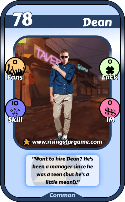
The card chosen for this post was 78 Dean, which gave the impression that it could be done quite easily in general, this is where my impressions about it were wrong, when starting the work on the card, I managed to find the shape of the figure that later I would give life to the pixelated version of Dean, at the beginning of the work I had few complications and it seemed that it would advance quickly... until I reached a point where it got complicated. It can be seen in the original card that Dean wears somewhat particular clothes, which at first glance seem to maintain a general color...well, in reality, taking into account that to give realism to the pixelated image, lights and shadows are very important... Dean's clothes have a lot of play of light and shadow, something that made him have to spend more time on the design, otherwise the final result would not be similar to 78 Dean... which it went against the goal of achieving a pixelated version of the card.

Here: the spoiler

In this sense, I tried to progress little by little... keeping calm favored constant progress in the work, it is true that I am still not completely used to noticing the details or to easily recognize the parts or changes that must be made to give the desired effect, but I was able to achieve to a large extent, a good similarity with the original card, although in the end I decided to give it a personal touch, you tell me what you think, I will be attentive to the comments. 😊
click here: the pixelated version

For the development of this pixelated version there was no musical accompaniment as in the last designs that I showed, however when thinking about what musical style could go with Dean, I imagined it would be a danceable song, thinking about that I went to YouTube and one of the songs that I had been listening to a few weeks ago was going very well with what I was looking for. I must say that the original video clip came out recently, but I didn't like it very much, so I preferred to share the lyric video of the song, although I could also recommend watching some of the compilation videos of dances based on the title song " Good Sin”, some steps make you want to do them, at least that's how it happened to me 😆
Good vibes!!!


!PIZZA
$PIZZA slices delivered:
@nupulse(4/15) tipped @ceheran