Finding inspiration in Rising Star
EN
Some time ago I started on the pixelated path of things, learning little by little the basics of what pixel art is, in previous posts I showed some of my first drawings, some of which were versions of character cards from Rising Star. I also commented before that my laptop's hard drive died, several projects were lost there, some finished and others in progress, but it meant a lot of time invested that would not return. Now I am with new images and new practices, this time being other RS cards that inspired me.


When starting with the music lessons, we first do the singing lessons, especially since it is the one that requires the least level requirements to be able to do it; the instrument that enhances these lessons are the microphones, as expected, many players accumulate this instrument from the first levels, it is true that several others change to different instruments when they can already access the minimum requirements of the lessons to which they belong, but in my case I kept the microphones because in the packs I was lucky that I almost always had 1 or 2 microphones to add to the collection, which kept the singing lesson attractive to get Skill with which to counteract the EGO.

It is precisely the microphone cards that served as inspiration for one of my recent practices. What made this practice interesting was that I began to put together my own color palette.
To get into context a bit, a color palette has those colors and/or shades thereof that will be or were used in a drawing, in this case of pixel art. The requirement is that they have a certain harmony to be able to create lights and shadows, taking into account that we are restricted to 1 pixel to denote shaded parts or illuminated parts, apart from giving life to the drawing in general.

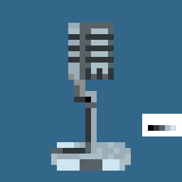
As can be seen, I placed the colors I used in a white box, trying to maintain an order, it is true that I had to change some more than once to achieve the desired effect, apart from that I tried to give it a background color that would help create the illusion... was it good? Do you recognize which card it is?
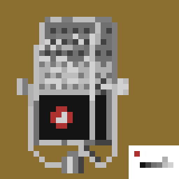
In this other one, what was difficult to achieve were the variations of lights and shadows, this is due to the fact that the original design, being larger in size, could show more details that made up the whole, for which I had to choose the colors more carefully. different colors and shades to give shape to my little pixel art, as expected, I reduced the details to a minimum and although it is not entirely perfect, I think the goal has been achieved. What do you think?
I still have some other pixelated designs of the Rising Star cards, I will show little by little each one of these trying to bring a surprise, since I am still experimenting with pixel art animation, although it requires a little more patience to give it a proper look. natural movement, in addition to the fact that in the designs the lights and shadows will vary for this purpose, which extends the working time.
Until next time and good vibes!!!
Don't have a Rising Star account yet?
Just follow the steps below:
Create your Hive account HERE
Create your Rising Star account HERE
Join Discord Chat HERE


-Texto traducido con Google traductor-
-Imágenes modificadas con Spark Post - GIMP - Libresprite-

!PIZZA
whoa!!! mucha !PIZZA
Gracias Billy!
$PIZZA slices delivered:
nupulse tipped ceheran
@ceheran(1/5) tipped @nupulse